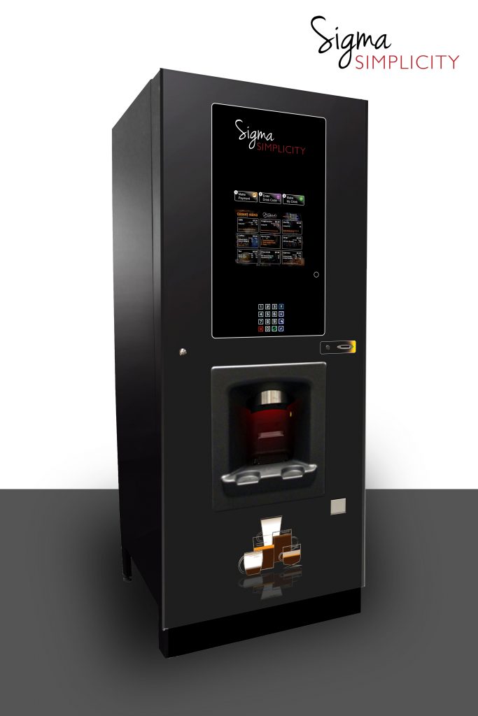
Visual Upgrade for Increased Drinks Sale

The sigma Range has been a favourite with many customers over the last few years. With such positive customer feedback, the main changes to the Sigma machines have been smaller tweaks on the inside, with improvements towards operation and drinks quality.
After listening to customer feedback and working alongside our distributors, we have now made it our mission in 2019 to remove any perceived obstacle to purchasing a quality hot beverage from the Sigma machines. we want to enable you to capitalise on your machines’ revenue by optimising the number of drinks sold.
So what did we do?…

Clear Instruction
The inclusion of an attractive instructional panel overcomes any objection to interacting with the machine. The instructions on the machine feature clear calls-to-action for the potential customer. ‘Make Payment’, ‘Select Drink’, ‘Make My Drink’.
Nothing stands in the way of grabbing a quick bean-to-cup coffee from a Sigma.

Faux-Screen Design
A new, slick design has been implemented on our stock Sigma graphics. A contrasting black on dark grey design that consolidates the media screen, instructional panels and drink selection menus.
Highlighting ‘Make Payment’ instruction with the same colour as the coin sloot is another improvement to make using the machine more simple and straightforward.

